Do you really need those line-clamps and nowraps?
After getting my first Forgejo PR merged today I was struck by the realisation that I finally have a linkable public example of a type of accessibility bugfix that's been a recurring thing for years across basically every site and app I've ever worked on. So I can finally get this off my chest. Everyone's CSS is full of line-clamps and nowraps that serve little to no practical purpose, and prevent visually impaired users from accessing content.
What's line-clamp and nowrap?
The
line-clamp
CSS property lets you limit how many lines a given piece of text can take up. If
you set line-clamp: 2, for example, then that element's content will be
truncated to two lines, and everything after that is chopped off and hidden.
The
white-space
CSS property has a value called nowrap that lets you force the text in an
element not to wrap onto multiple lines. By setting white-space: nowrap,
you're disabling text reflow on your element's text content in favour of one
long line. Tailwind's truncate class demonstrates the most commonly used
nowrap setup.
.truncate {
  white-space: nowrap;
  overflow: hidden;
  text-overflow: ellipsis;
}
The above forces your text to fit on one line and adds a "…" ellipsis on the end if anything needs chopping off to make it fit.
And this is "everywhere", is it?
Not only is it absolutely everywhere, it has been everywhere for ages.
Right now, in 2026, shadcn/ui is the most popular open source component library
in the world. Its button component includes nowrap.
Ten years ago, back in 2016, I was at a well known global tech company who were
hiring a lot, and so I spent a lot of time in coding interviews. Part of the
interview had candidates build a button in HTML and CSS. Including nowrap in
your solution gave you extra credit in the evaluation criteria for that
interview, because that's the level of mindshare that this practice has enjoyed.
And that's a problem?
People with visual impairments tend to configure their devices to use larger text. This adaptation reduces the impact that their impaired vision has on their lives. That this is possible at all is a very cool thing about computers! If you think about it, digitalisation is society's big chance to deprecate lots of this sort of structural oppression.
The whole point of line-clamp and nowrap is that they limit how much space text can take up on the screen. And when text is larger, it takes up more space on the screen. So users of large text almost always lose access to some of the content in elements where line-clamp or nowrap are applied.
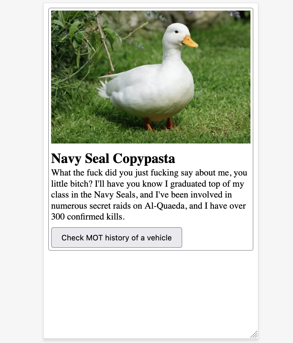
Here's an example of a very typical card component that any web developer
anywhere might be tasked with implementing. The heading and button have
nowrap, and the text has line-clamp: 5. It's at normal 100% text size here,
where those styles aren't affecting the content.
It's a really common defensive practice to chuck those kinds of styles on card components like these. You're working from a Figma design that showcases a few of them in a row or column, and they look great there, thanks to the neat, rhythmic uniformity of the layout. You're taking pride in your work, and you really want the users of your component to enjoy that same gorgeous design vision that you saw in Figma. You add these layout constraints in good faith, with love in your heart.
But here's what a visually impaired user with text at 200% sees.
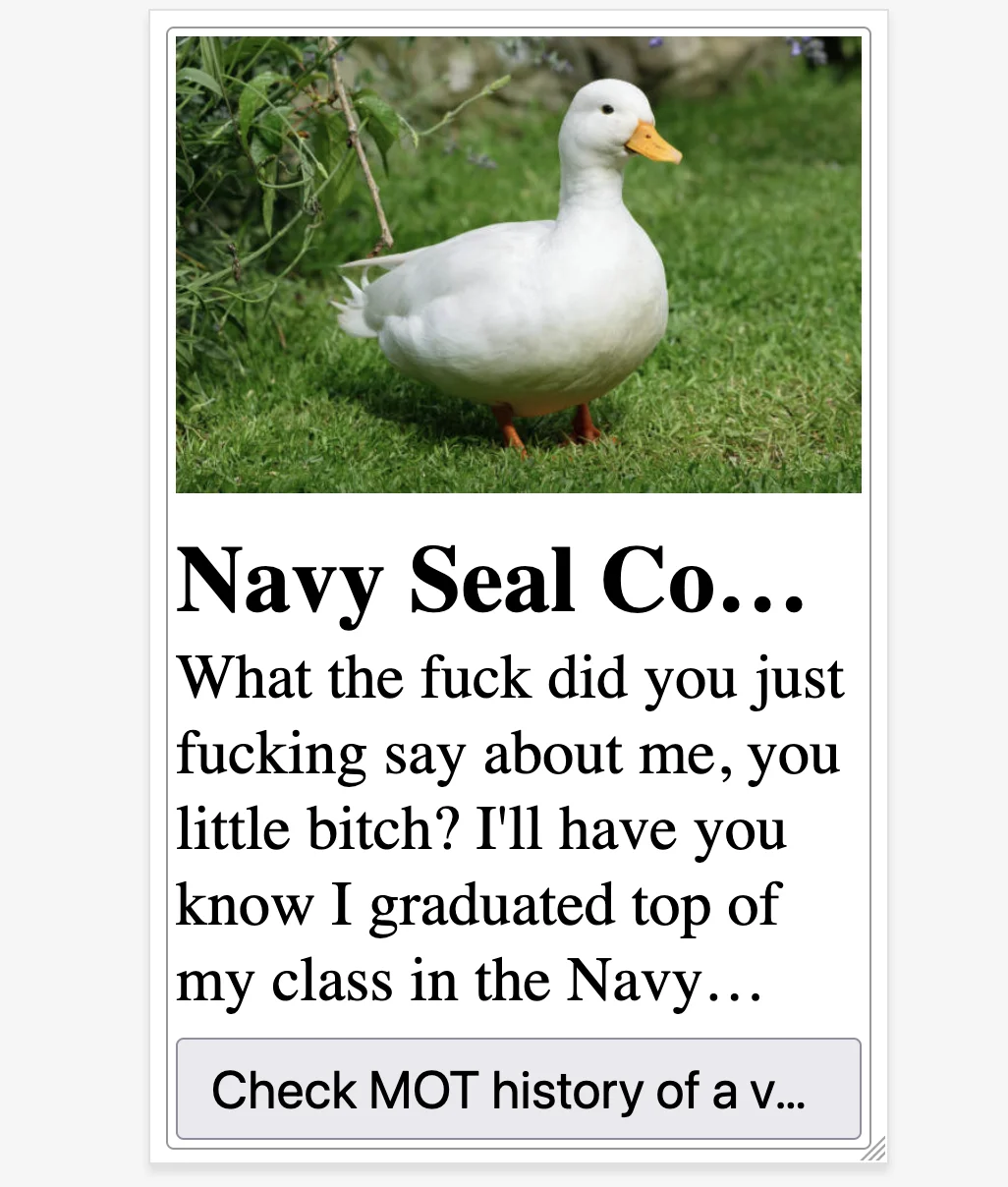
Navy Seal Contest? Navy Seal Cough Medicine? Check MOT history of a van? Of a Volkswagen? Your visually impaired user may never find out.
This is what WCAG success criterion 1.4.4 is all about.
Except for captions and images of text, text can be resized without assistive technology up to 200 percent without loss of content or functionality.
What should I do instead?
The best move here is to stay out of it and let the browser do its thing. If you find yourself tempted to chuck in a line-wrap or a nowrap, challenge the impulse. Do you need it for an important reason such as for constraining the height of an element inside a virtualised list? If not, probably just don't bother then.
It can be tempting to try fine-tuning your line-clamps to make things just barely compliant at 200% zoom. I think this is the wrong mindset, and stems from a misconception that since accessibility can sometimes be challenging, then practicing it well must require an increase in engineering effort. Handling text resizing is a wonderful example of how accessibility often wants you to do less rather than more.
It's true, your button component won't look quite as good when its text content reflows onto multiple lines at 200% zoom. But the entire reason why your button component exists is for people to read its label and then click it if the text matches their current goal. So what's more important?
Your visually impaired users care more about accomplishing their goals than experiencing a particular layout. And your platform – the web browser – is great at reflowing text to help them with that. The web browser is a piece of real-world magic capable of breaking down a barrier in a way that would have been unimaginable 100 years ago, and as a web developer, all you have to do is to let it.